Thursday, May 27, 2010

Girl Retouch - Spring Semester

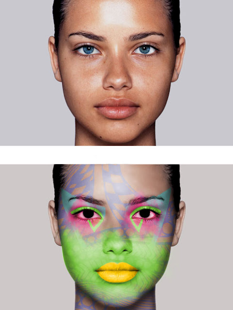
Oh GaGa, how you inspire us to create such bizarre pieces. This project enabled me to focus on several tools including brush, blur, healing, and clone. The use of adjustment layers allowed the development of color.
Jesus Christ Superstar Poster - Spring Semester

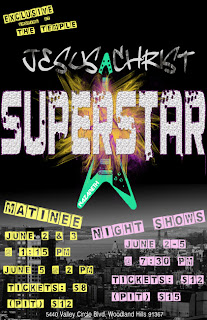
The spring musical at my high school was none other than Jesus Christ Superstar. Being enrolled in the graphic arts, it was my job to create a Jesus Christ masterpiece. Alternating type, masking gradients, and using brush tools all allowed me to create a poster that would be considered for this glorious musical. Ironically, this poster only won the heart of my mother, not those in charge over at JCS.
Dear Old Grandfather - Spring Semester

Dear Old Grandfather...a rustic, tortured photo transformed into a colorful sensation. Techniques such as dust and scratches, the history brush, color adjustment layers, cloning, healing, and a little elbow grease brought this picture together.

Crew, Handsome Guy, Family - Spring Semester

Embossing type into this photo created the ultimate "crew" experience.


Spot tool, clone tool, dodge tool, layer transparency. 
All tools used to make this handsome guy look years younger.


Photoshop allowed me to use dust and scratches to remove a musty photo appearance, the clone tool to remove the photo's tape along the edges, and the history brush to bring back some of the vintage feel.

CD Front Cover - Spring Semester

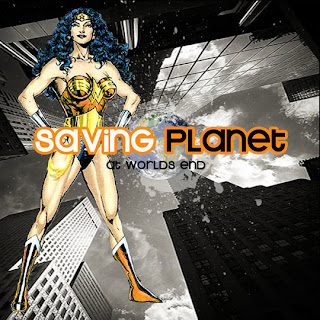
Every pea needs a pod. This just so happens to be the pod to my previously constructed back CD cover. Housing the condescending concept of an imaginary band, this cover demonstrates use of wand selection, masking, and the brush tool. I'm not quite sure what inspired this random spurt of grunge work, but I suppose it helped with the overall design.

CD Back Cover - Spring Semester

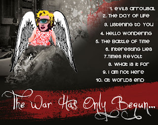
It's been said that time heals everything. Well, that concept doesn't exactly apply to the feel of this CD back cover. Creations of fire, awkward splatters, unknown monsters, all things that were built by masking, brush and type tools. Let's just say, the war has only begun...

Commodities Postcard - Spring Semester

The first project assigned in Photoshop, commodities of culture. My take on this assignment specifically focuses on life in the 1950s, structured dresses, vintage stovetops, poodles, bows, the whole shabang. My first experience with the wand tool did not exceed anyones expectations, but it is has struck the beginning to my newly discovered world of Photoshop.

Zoo Post Card - Spring Semester

Dear photoshop, creating post cards is oh so easy when you're around. Boxing photos, contrasting type, resizing photos. All things that have never been easier with your kind help.

Soda Label - Fall Semester

 "ATTENTION, today you will be creating a soda label." Once my ears heard those very words my brain expansion traveled off the charts. Ideas sparked and images flurried through my mind. "Okay, Victoria, let's make a soda that is light, friendly, and crisp all at the same time," I thought. From my mind to the computer, with a little trouble in between, Halo Fizz became my end result. Constructed in Illustrator, Halo Fizz contains edited type, drop shadow, bleed, and a fresh tone.

Color Predictions - Fall Semester

I sat next to the fireplace holding a light pink package stamped obnoxiously with the Barbie logo. As a room full of people stared in awe, I sat in pity. I felt terrible for myself, I was receiving a Barbie for my fourth birthday. A blonde, plastic doll that refused to ever talk to me, or braid its hair. By the time I was able to walk the mall with my mother, I had only been interested in clothes. Fashion, for some reason, has always sparked my attention. Maybe its the constant change in style, or just looking nice. Either way, it is something that has always been a part of me. The Color Predictions assignment was to create a poster in Illustrator exampling a woman's silhouette for Spring 2010 fashions. Creating flowers and spirals, gradients and leaves, this assignment brought me to understand masking in Illustrator.  

MRS Logo Design - Fall Semester

A manufacturing company in need of a new logo came to El Camino Real High School to have the task completed. You will not be seeing this logo on any business card or website anytime soon, or for the rest of your life because my design was not chosen. Yet, I tried with all my ability to create a simple, young logo. Text boxes and edited type completed the overall construction of this design.

Restaurant Identity Suite - Fall Semester

From the four designs created down below, this was the lucky winner. I edited the format creating a cute, little business care package: an envelope, business card, and note pad. My condolences follow to the nonexistence of this restaurant, I could really go for some nice baked salmon right now.

Restaurant Logo Design - Fall Semester

All aboard! Benny's Seafood Ship logos were created in Illustrator using RGB color, than converted to black and white. Several tools were used to assemble these images providing entertainment for you, and 80 points to add to my grade for myself                                             

Letter Form - Fall Semester

Using ONLY glyphs in Illustrator, I created this wonderful masterpiece. I'm kidding. I created a nose, sneezing, with snot. Sorry if any boogers get on you while your viewing this.

Killer Bee Bookmark - Fall Semester

A bookmark to remember...haha not quite. Changing the form of each individual bee I created this bookmark demonstrating gradients, opacity, and image selection.